
Web Design · E-commerce · Brand System
forbes.design
I merged my Wix portfolio and my Shopify apparel store into one site that shows the work, sells the goods and books new clients. Designed, built and shipped on Shopify.

At a glance
- Problem
- My design work lived on a Wix site and my apparel lived on a Shopify store. Two designs, two logins, and every visitor only ever saw half the story.
- Users
- Recruiters and hiring managers, small business owners looking for a designer, and shoppers looking for Detroit and Michigan apparel.
- My role
- All of it: strategy, information architecture, brand system, UX and UI, the front-end build in Shopify Liquid, copy, SEO and launch.
- Outcome
- One site at www.forbes.design, with the old domains redirecting to it and a draft-first workflow that ships improvements several times a week.
The challenge
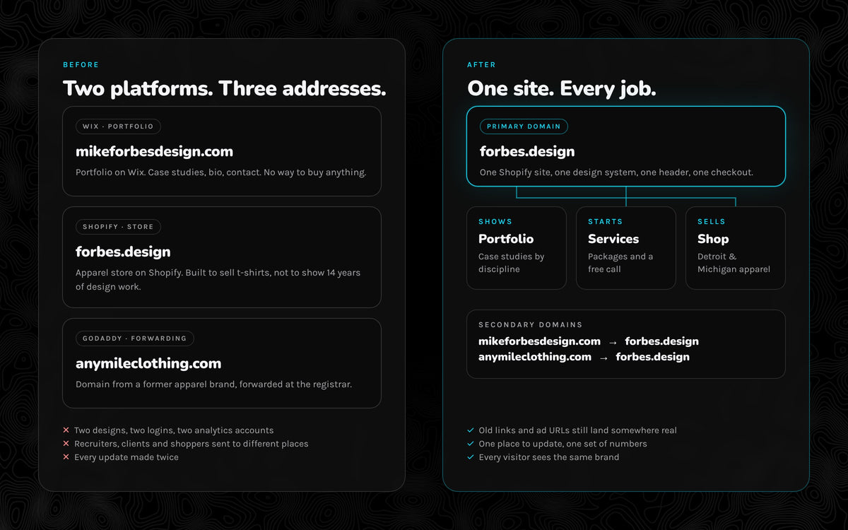
For years my work lived in two places. mikeforbesdesign.com, a Wix site, held 14 years of medical device, software and product case studies. forbes.design, a Shopify store, sold Detroit and Michigan apparel. A third address, anymileclothing.com, still forwarded from a brand I had closed.
Each site told half the story. Hiring managers never saw that I run a store end to end. Shoppers never saw the design work behind the shirts. And every update had to be made twice.
Who it's for
Before moving a single page, I wrote down who arrives and what each of them needs in the first ten seconds. Three very different visitors, one site.
Recruiters & hiring managers
Need proof fast: real projects, my role and the outcome. They should land on work, not t-shirts.
Small business owners
Need to trust me with their brand or website, then see one clear next step: a free 15-minute call.
Shoppers
Need to find a Detroit or Michigan design they love, pick a size and check out without friction.
Information architecture
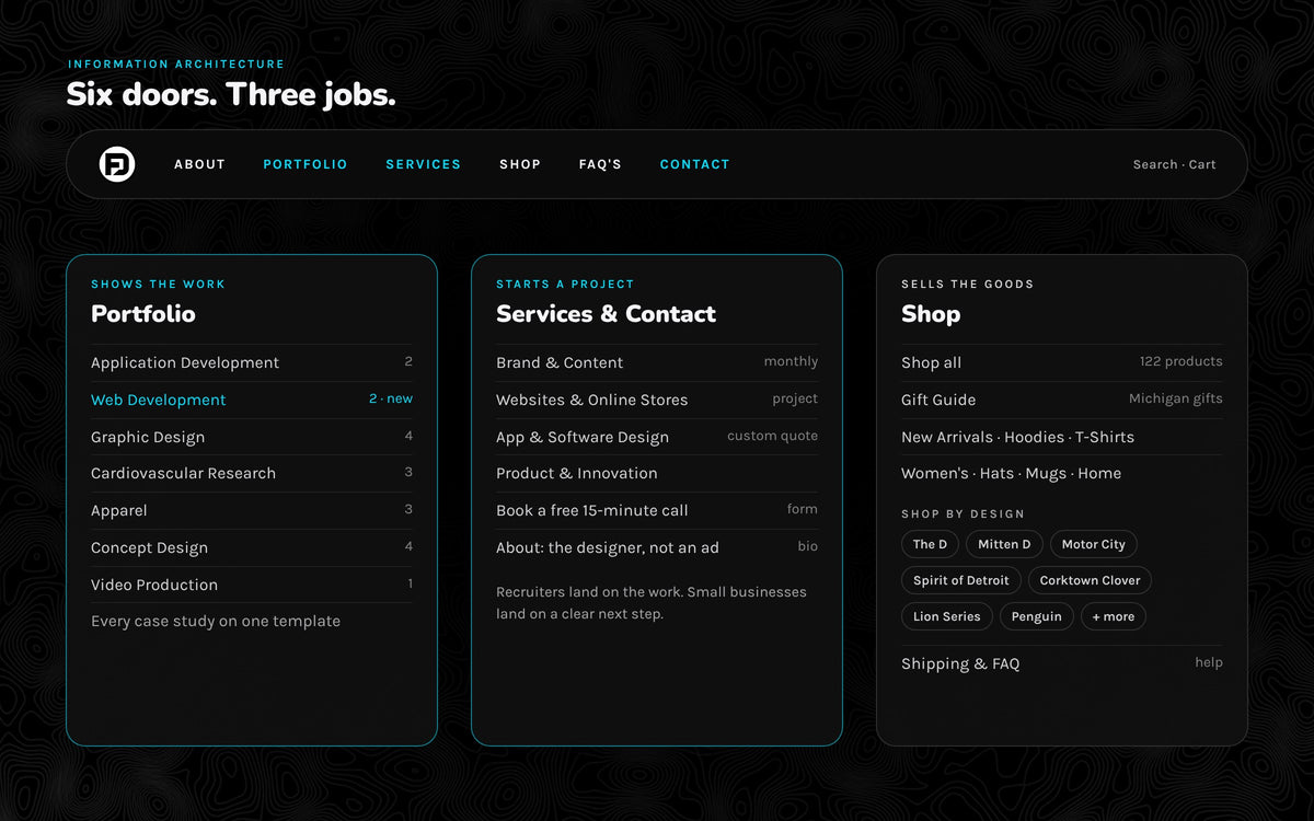
One header, six doors: About, Portfolio, Services, Shop, FAQ's and Contact. Portfolio opens by discipline, so a medical device engineer and a coffee shop owner each find their kind of work in one click. Shop goes straight to the store, while every /collections link already running in ads keeps working.
About became a designer bio rather than a sales pitch. Services holds the packages. Contact books the call.
Write the brand down first
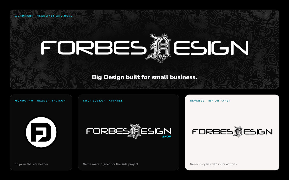
Two sites had drifted into two looks, so I wrote a brand guide before styling anything. It starts with one promise, Big Design built for small business, and three marks with one job each: the wordmark for headlines, the FD monogram for small spaces and a shop lockup for the apparel.
The logo is always white on black or Ink on Paper. Never cyan, because cyan is for things people act on.
Color and type
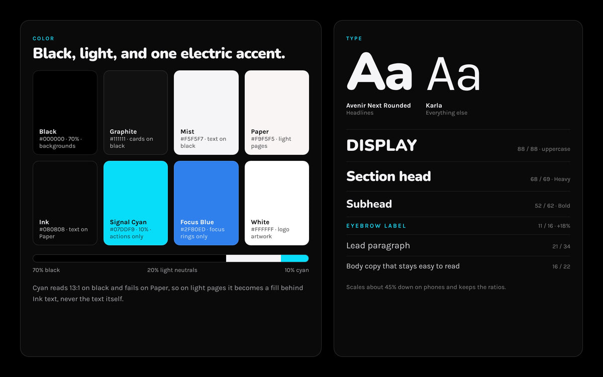
A near-black palette with one electric accent: about 70% black, 20% light neutrals and 10% Signal Cyan. Cyan reads at roughly 13:1 on black but fails on Paper, so on light pages it becomes a fill behind Ink text instead of text itself.
Avenir Next Rounded carries the headlines and Karla carries everything else. Early on, gray body copy on the dark pages was hard to read, so body text moved to white and secondary text became Mist at reduced opacity rather than a new gray.
A design system in code
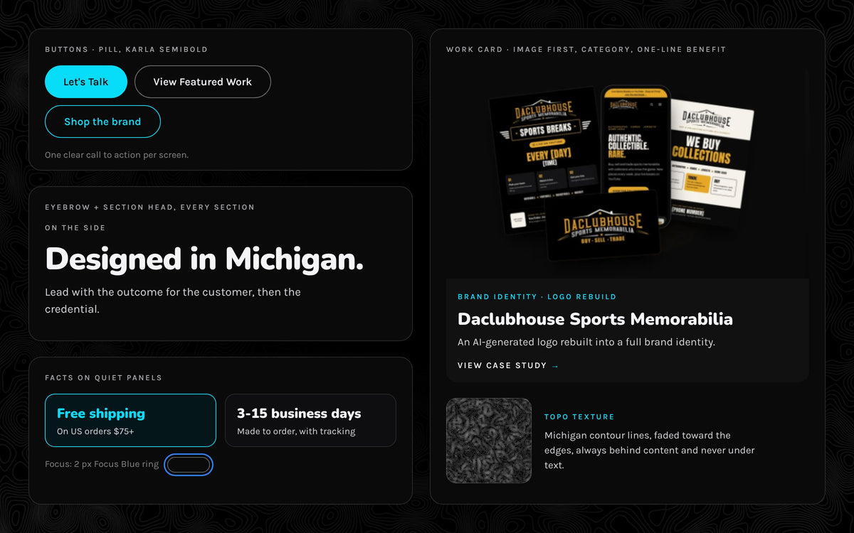
Instead of styling page by page, I built one shared layer of tokens and components in Shopify Liquid: pill buttons, eyebrow labels, quiet fact panels, work cards, the topo band and focus rings. Case studies run on reusable templates, so a new project page is mostly content, not code.
Accessibility lives in that layer too. Menus open on hover or keyboard focus and close on Escape, focus rings stay visible, product photos carry descriptive alt text, and animation holds still for visitors who prefer reduced motion.
The work comes first
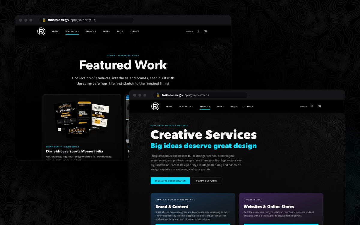
The homepage opens on the promise, then goes straight to featured projects with video. Featured Work and each discipline page use the same card: image first, a category line, the project name and a one-line benefit. Services turns all of that into packages a small business can act on.
A store that belongs
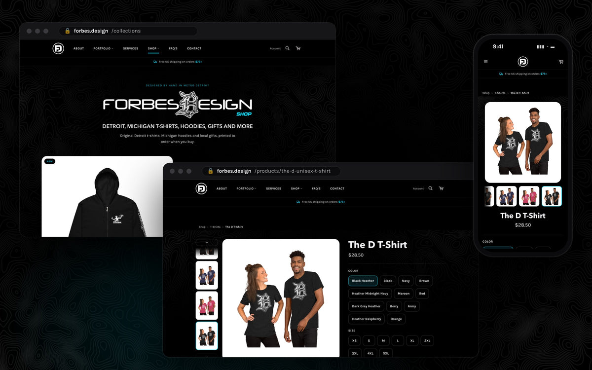
The shop kept everything that sells: print-on-demand fulfillment, 122 products across 35 collections, color and size pills, and a free-shipping message from the first screen to the cart. It just looks like the same designer made it now.
Search was part of the build, not an afterthought: product schema, breadcrumbs, descriptive alt text, and a shop page written for searches like Detroit t-shirts and Michigan gifts.
Built for phones
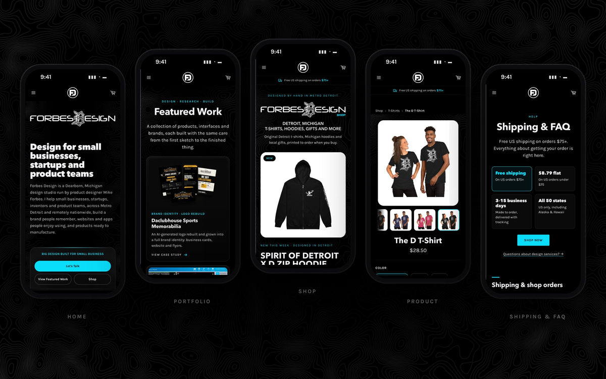
Every template was designed and checked at phone width: a compact header with the FD mark centered, thumb-sized pills and buttons, and headlines that scale down while keeping their ratios. The shipping facts that matter most sit in four panels you can read without scrolling.
How it ships
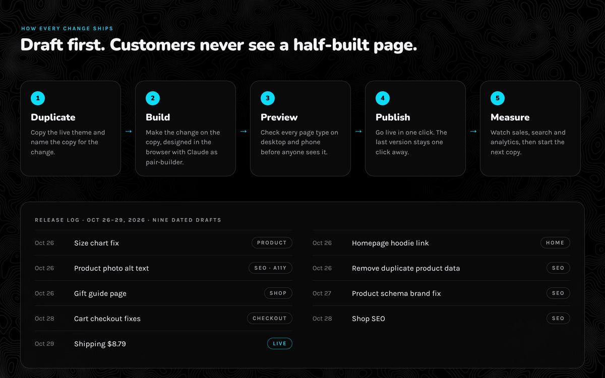
I design in the browser and build with Claude as my pair-builder, writing custom Shopify sections and templates directly against the theme. Nothing is edited live. Each change starts as a dated copy of the live theme, gets previewed on every page type, and only then goes live, with the previous version one click away.
That loop is what makes small, frequent improvements safe. Over four days in October 2026, nine dated drafts shipped: a size chart fix, product alt text, product schema, cart fixes, shop SEO and a shipping-rate change.
Outcome
One site where the work comes first, the store keeps selling and every page feels like it came from the same hand. I can change any part of it myself, the same day.
It's also proof of a service I offer. If your business needs a website or an online store, this is the kind of work I'll do for you, on whatever platform fits.